A road safety poster works if it changes one behavior in the few seconds someone spends looking at it. Try to cover speeding, phones, and seat belts on the same sheet of paper, and it stops working for all three. This guide covers what makes a poster effective, ideas by risk area, and the terminology and rules that differ if you’re designing for a US or a UK audience.
What is a road safety poster?
A road safety poster (sometimes called a traffic safety poster) pairs a short slogan with an image to push one specific safe behavior on the road. Schools use them to teach children how to cross safely. Workplaces put them near loading docks and staff car parks.
National campaigns run on the same idea: the UK’s THINK! programme, run by the Department for Transport since 2000, and the US National Highway Traffic Safety Administration’s Click It or Ticket and Put Phone Away or Pay campaigns are both built around poster-style messaging.
Nobody stops to read three paragraphs pinned to a corkboard. The whole design problem is fitting one idea into something a person absorbs while walking past.
What makes an effective road safety poster?
A few traits show up again and again in the posters that actually change behavior.
One message per poster: a design about speeding shouldn’t also try to cover seat belts. The image should work even if you cover up the slogan. The slogan itself should sit under about eight words and name the action, not just the danger slow down at the crossing tells someone what to do speed kills just describes a problem. And the contrast needs to hold up from several meters away, not just up close.
Everything else the statistic, the logo, the fine print should shrink before the core message does.
Road safety poster ideas by risk area
Speeding
Speed is the easiest topic to flatten into generic phrasing, so anchor it to something specific: stopping distance, a school zone, a residential street.
- 5 over feels like nothing. It isn’t.
- The limit isn’t a suggestion.
- Slow streets, safe kids.
In the UK, 20mph zones have become more common in towns and cities as part of the government’s road safety push, so a poster near a school or residential area can reference the specific limit rather than a generic slow down. US school zones typically drop to 15–25 mph during school hours, usually marked with flashing beacons.
Seat belts
NHTSA’s own numbers make the case better than any slogan: in 2024, nearly half of passenger vehicle occupants killed in crashes weren’t wearing a seat belt, and the share was even higher at night. A poster doesn’t need to invent a statistic when one this direct already exists just cite it accurately.
- Buckle up. It’s the only move that matters.
- Every seat. Every trip. Every time.
Distracted driving
NHTSA recorded 3,208 deaths in distraction-affected crashes in 2024, around 8% of all US traffic fatalities that year, and runs its Put Phone Away or Pay enforcement campaign each spring. Name the specific behavior texting, scrolling, fiddling with GPS instead of a vague don’t be distracted.
- The text can wait. The crash can’t be undone.
- Eyes up. Phone down.
Drink and drug driving
Get the numbers right here, since the rules genuinely differ by country. In England, Wales, and Northern Ireland, the legal limit is 80mg of alcohol per 100ml of blood. Scotland has run a stricter 50mg limit since 2014, and the UK government’s January 2026 Road Safety Strategy proposes bringing England and Wales down to match it.
In the US, the standard is a 0.08% blood alcohol concentration nationwide, with zero tolerance for drivers under 21 in every state.
The long-running US Ad Council line Friends don’t let friends drive drunk is still one of the most recognized road safety slogans ever produced a useful reference point for tone even if you write something original. Something shorter also works One drink too many is one drink.
For a country-by-country breakdown of drink-driving penalties and limits, see our guide to traffic rules and road safety regulations around the world.
Pedestrian safety
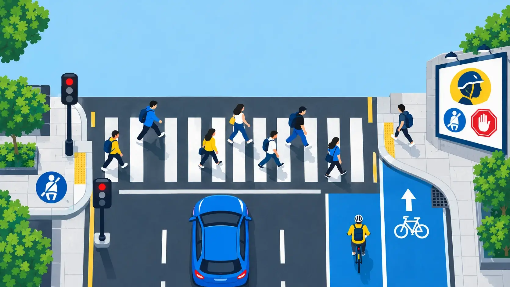
Terminology shifts more here than almost anywhere else in this list. A US crosswalk might be a UK zebra crossing (uncontrolled, black-and-white stripes) a pelican crossing (push-button, traffic-light controlled) or a puffin crossing (sensor-based, no green man to watch for). Whichever term fits your audience, the message stays the same: Look twice. Live once. Or, if you want something less well-worn Cross with your eyes, not your habit.
Cycling safety
Helmets, lights, and high-visibility clothing are the recurring visual anchors here, especially for posters aimed at commuter cyclists rather than children. Two lines that hold up: Same road. Same rules. and “Be seen before you’re missed.”
Motorcycle safety
A large share of car-motorcycle collisions happen because a driver simply didn’t see the bike, which is why motorcycle campaigns in both countries lean so heavily on visibility. Look twice, save a life is the standard line used on both sides of the Atlantic worth borrowing the sentiment even if you change the wording.
School zone safety
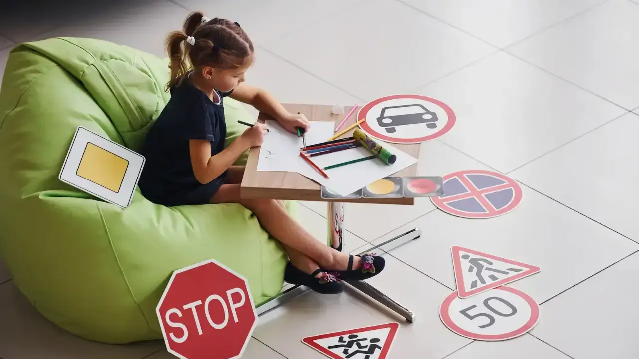
This is one of the few areas where the poster is often a classroom project rather than a professional design, which changes what “effective” means. A child-drawn poster with one clear message can outperform a polished one that tries to cover too much. Our guide on kids’ road safety education covers the wider programs these posters usually support.
Road work and construction zone safety
Cones, hi-vis vests, and reduced speed limits are visual shorthand people already recognize, so a poster here works best when it adds the one thing they don’t already know which lane to expect closed, say, or what the reduced limit actually is in that specific zone.
Poster ideas for schools, drivers, and pedestrians
Where a poster gets displayed changes what it needs to do.
In schools, posters double as a teaching tool, so simple and colorful is fine even good. A hallway series where each poster covers one rule (stop, look, listen, wait) usually beats a single poster trying to cover all four.
For drivers, break rooms, staff car parks, and depot entrances are where these posters actually get seen, so the message needs to survive a five-second glance on the way to a vehicle. Our comparison of online and in-person driving school training is a useful reference if the poster is part of a wider driver education effort.
For pedestrians and cyclists, transit stops and car parks are the natural spots. A poster near a car park exit benefits from being specific to that space; our UK parking lot guide covers the layout and visibility issues that make these areas higher-risk for pedestrians in the first place.
How to make a road safety poster?
Start by deciding the single behavior you want changed, before you touch a design tool. Then think about where it’ll hang a primary school corridor calls for a different tone, size, and level of detail than a warehouse loading bay.
Pick one strong visual anchor rather than a collage of images, and write the slogan last, not first. Once the image and audience are settled, it usually only needs eight or ten words. Use high contrast dark text on a light background, or the reverse since it reads from further away than subtle color pairings do.
If you’re using a statistic, get the source right; a specific, correctly attributed number carries more weight than a rounded, vague one. And before you finalize anything, print a draft and look at it from across a room. Design software makes everything look closer and bigger than it will on a wall.
What information should a road safety poster include?
At minimum: one clear message, one supporting image, and a short, action-oriented slogan. A statistic, a source, a campaign logo, a QR code any of these can go on if they don’t compete for attention with those three basics. More text rarely means more persuasion; it usually means the poster gets skipped.
US vs UK road safety poster considerations
A few things worth getting right if a poster, or the content around it, needs to speak to both audiences:
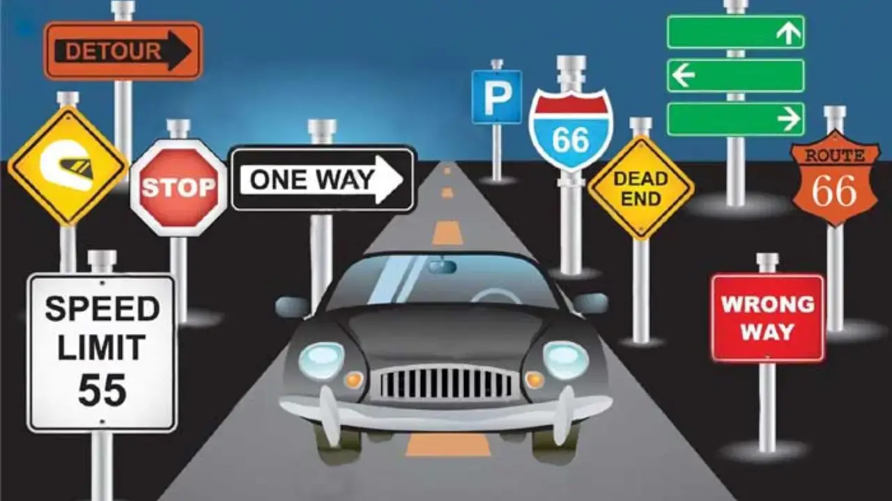
Sidewalk (US) vs pavement (UK); crosswalk (US) vs zebra, pelican, or puffin crossing (UK), depending on the type. Speed limit signs look different too US signs are rectangular, black text on white or yellow, while UK signs are circular with a red ring. School zones: the US typically uses flashing beacons and a posted reduced limit, often 15–25 mph; the UK relies more on zigzag road markings and, increasingly, 20mph zones.
Drink driving limits also split: 0.08% BAC nationwide in the US, 80mg/100ml blood in England, Wales, and Northern Ireland, and 50mg/100ml in Scotland a gap the UK government is currently proposing to close.
Campaign names worth referencing, though not copying, are THINK! in the UK and Click It or Ticket and Put Phone Away or Pay in the US. Both countries do at least measure speed in miles per hour, so “mph” doesn’t need converting for either audience.
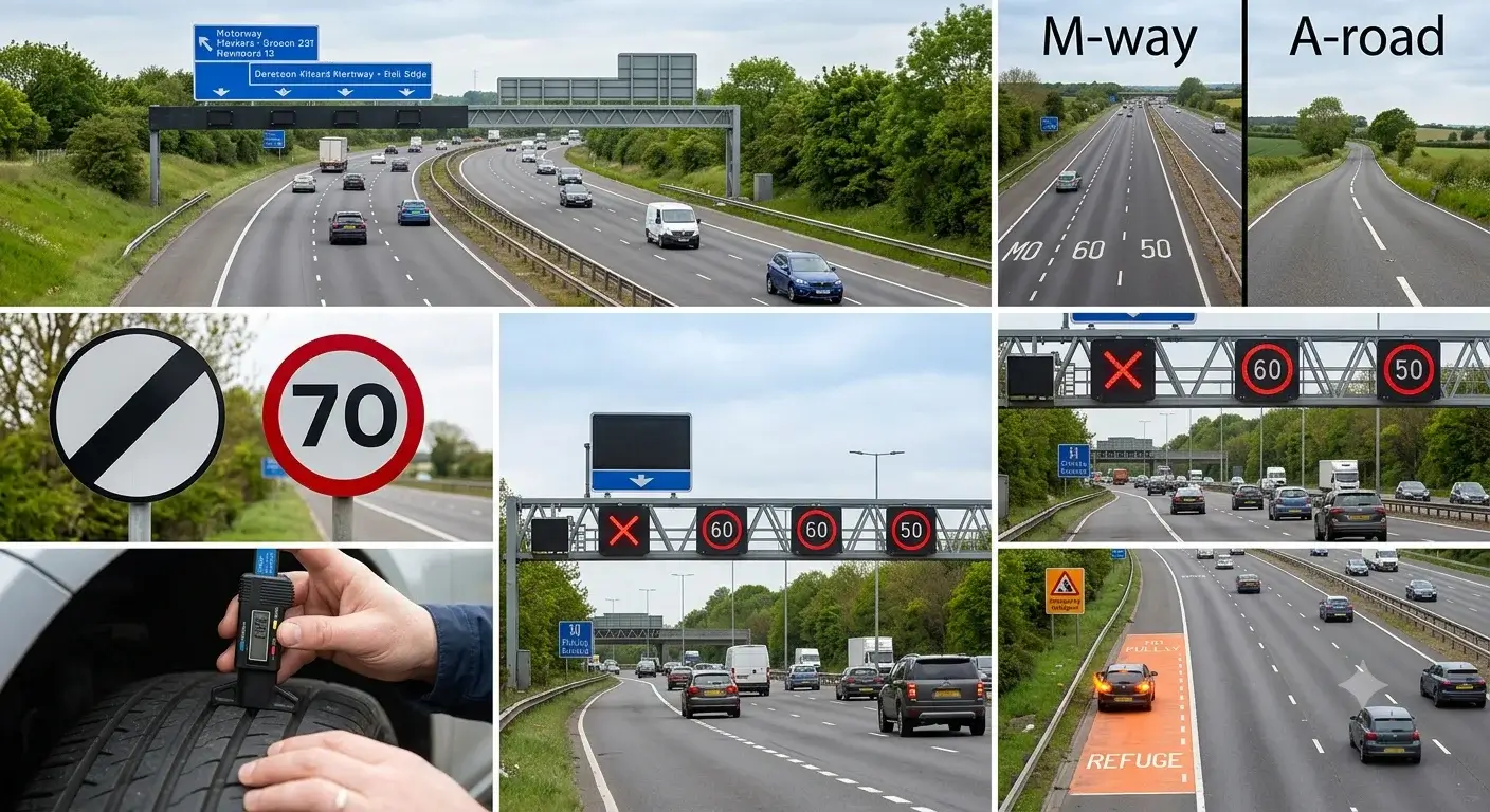
Our guide to highway driving in the UK covers UK-specific road types and signage in more depth if a poster needs to reference motorways or dual carriageways.
Common mistakes to avoid
Trying to cover too much is the big one one poster, one behavior. Three messages on a single poster usually changes nothing.
Vague slogans are the next most common problem. Drive safe doesn’t tell anyone what to actually do differently. Text that’s too small to read at a normal distance has the same effect: if people have to walk up to it, most won’t bother.
Shock imagery is worth a second thought too. What works for an adult driver campaign can be inappropriate, or just ignored, in a school hallway. And if you’re not sure of a statistic, cut it or find the real source a wrong number undermines the whole poster once anyone checks it.
Along the same lines, borrow the tone of an official campaign like THINK! or NHTSA’s work if you want, but not their logos or taglines; those belong to the agencies that made them.
Frequently Asked Questions
What is a road safety poster?
A short slogan paired with an image, built to promote one specific safe driving or pedestrian behavior. Schools, workplaces, and government road safety campaigns all use them.
What should it include?
A single clear message, a supporting visual, and a short, action-oriented slogan. A statistic, source, or logo can be added, but only if it doesn’t crowd out those three basics.
What are some good ideas?
Focus on one risk at a time: speeding, seat belts, distracted driving, drink or drug driving, pedestrian safety, cycling, motorcycle visibility, school zones, or road work each as its own poster rather than combined.
What makes a good slogan?
Short, generally under ten words, and specific about the action rather than just the danger. Skip vague phrasing like “drive safe. Buckle up, it’s the only move that matters and Eyes up, phone down both name a clear action.
How do you actually make one?
Pick one message, know the audience and where it’ll be displayed, choose a single strong visual, write a short slogan, use high-contrast colors, and check the design at real viewing distance before printing.
What are the main messages road safety campaigns push?
Don’t speed, wear a seat belt, don’t drive distracted, don’t drive under the influence, and watch for pedestrians and cyclists.
How do these posters help children specifically?
They reinforce simple, repeatable rules stop, look, listen, wait, or cross at the crossing taught as part of road safety education. Simple, colorful designs tend to land better with younger children than realistic or text-heavy imagery.
What should a driver safety poster say?
Something specific to where it’s displayed, rather than a generic “drive safely.” A staff car park benefits from a phone-use reminder; a depot entrance benefits from a seat belt reminder tied to that routine.
Recommended sources
- NHTSA, Distracted Driving Dangers and Statistics — https://www.nhtsa.gov/risky-driving/distracted-driving
- NHTSA, Click It or Ticket campaign — https://www.nhtsa.gov/campaign/click-it-or-ticket
- UK Department for Transport / GOV.UK, “Thousands of lives to be saved under bold new Road Safety Strategy” — https://www.gov.uk/government/news/thousands-of-lives-to-be-saved-under-bold-new-road-safety-strategy
- Metropolitan Police, Alcohol and drug driving — https://www.met.police.uk/advice/advice-and-information/rs/road-safety/alcohol-drug-driving/
- House of Commons Library, Road safety briefing — https://commonslibrary.parliament.uk/research-briefings/cbp-10841/